How to Make Cover Art in 5 Easy Steps
To make cover art in 5 easy steps, start by choosing a theme that fits your music’s mood. This helps set the tone and gives your audience a glimpse of what to expect.
Next, sketch a layout to organize your title and images thoughtfully.
Then, gather high-quality visuals and arrange them with balance and focus. Make sure everything looks harmonious and eye-catching.
Add colors and typography that complement your theme while keeping text clear. The right fonts and hues make your cover art pop and convey your style.
Finally, review your design on different screens for clarity and impact. This step ensures your artwork looks great everywhere.
Keep going to discover tips that make your cover truly stand out. You’ve got this!
Key Takeaways
– Define a theme or mood that matches the music’s emotional tone using colors, imagery, and typography.
This helps set the right vibe for your cover art and makes it resonate with the music.
– Sketch a layout to plan the placement of title, images, and design elements for balanced composition.
Getting this down on paper first makes the digital design process way smoother.
– Source high-quality, royalty-free visuals and arrange them using design principles like Rule of Thirds.
Choosing the right images and positioning them well really brings your cover to life.
– Add colors, textures, and font styles that enhance readability and reflect the chosen theme.
Make sure everything looks good together and is easy to read at a glance.
– Review the design on various devices, check resolution and alignment, then save in required formats.
Double-checking ensures your cover art looks perfect everywhere it’s seen.
Choose a Theme or Mood
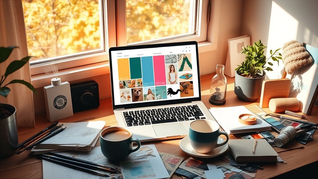
How do you want your cover art to make people feel? Defining the mood is your first step when creating album cover art. Whether you want it energetic, dark, romantic, or playful, your design elements should consistently reflect that vibe.
Choose imagery, colors, and typography that align perfectly with your intended mood. Consider your music genre too—minimalistic designs often suit electronic or indie, while vibrant visuals fit pop better. Using moodboards can help you gather inspiration and keep your theme focused.
Sticking to a strong mood not only guides your design choices but also makes your cover art visually cohesive and impactful. When your theme is clear, your audience connects emotionally before they even press play.
Sketch Your Layout
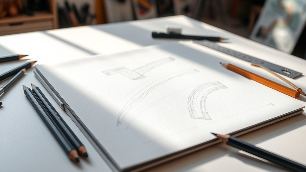
Where should you place your title, images, and other design elements? Start by sketching a rough layout of your cover art. Use light pencil strokes to map out space for the album title, artist name, and visuals.
Keep your sketch simple, focusing on main elements before adding details or color. Here are three tips for an effective design layout:
- Use grid lines or guides to ensure symmetry and proper alignment.
- Position elements to create balance and natural flow across the cover.
- Let the mood and message of your music guide the composition.
This approach helps you visualize your design clearly and makes adjustments easier before moving forward. Sketching your layout sets the foundation for a strong, cohesive cover art design.
Gather and Arrange Visual Elements
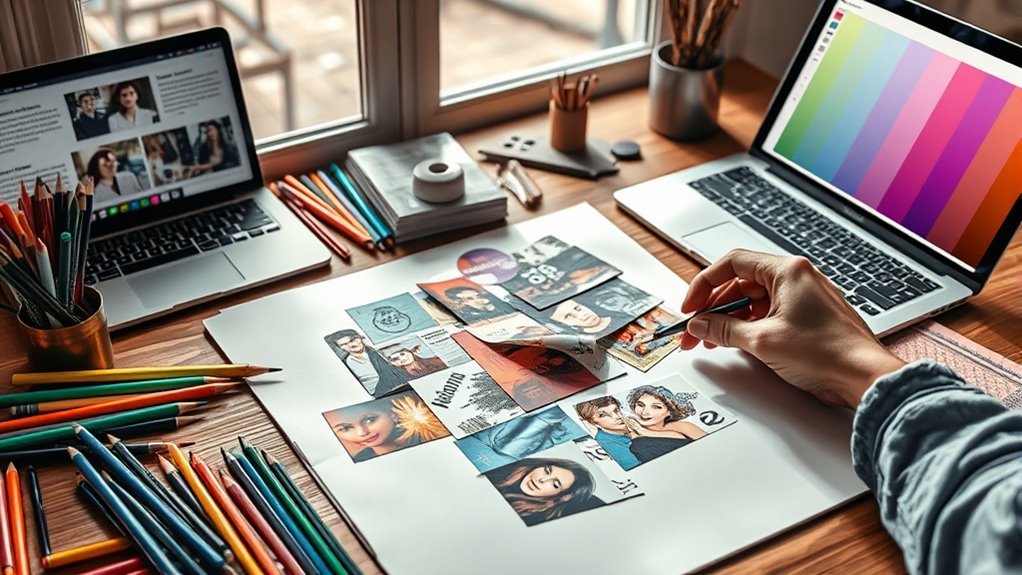
Although gathering your visual elements might seem straightforward, selecting high-quality images that reflect your music’s mood requires careful thought. Start by sourcing royalty-free images from sites like Unsplash or Pixabay that match your theme.
Once you have your images, arrange your visual elements on the canvas to create a balanced composition. Experiment with placement using design principles like the Rule of Thirds and visual hierarchy to highlight key parts of your artwork.
Layer and modify images with filters or overlays to enhance interest and match your aesthetic. This thoughtful composition guarantees your cover art visually represents your music and captures attention effectively before you move on to adding colors and typography.
Add Colors and Typography
Why settle for dull when you can make your cover art burst with color and personality? Adding colors and typography is key to making your design stand out.
Here’s how to nail it:
- Use a mix of coloring materials like markers or colored pencils to add vibrant textures that bring your design to life.
- Experiment with typography—try bold, italics, or handwritten fonts to highlight your song or artist name. Sketch text lightly before finalizing for a clean look.
- Apply color overlays, gradients, or filters that match your theme, creating depth without overpowering readability.
Just remember to balance colorful elements with clear typography so your title stands out even at small sizes. This approach guarantees your cover art grabs attention and communicates your style perfectly.
Review and Finalize Your Design
Once you finish your design, review it carefully on different devices and screen sizes to verify it looks sharp everywhere. Check that all text is legible, properly aligned, and free of typos or spelling errors.
Confirm the image resolution meets platform requirements, typically 3000×3000 pixels at 300 DPI, to ensure quality. Don’t hesitate to seek feedback from others; fresh eyes can spot issues you might miss.
After making any necessary adjustments, finalize your design by saving it in the required file format, usually JPEG or PNG. This careful review and finalization process guarantees your cover art looks professional and polished no matter where it’s displayed, helping your project stand out with crisp, clear visuals.
Frequently Asked Questions
How to Create a Cover Art?
You start by selecting images and colors that fit your music’s vibe. Then, use design tools like Canva to arrange elements, add text, apply effects, and finally save your cover art in the right format for sharing.
It’s pretty straightforward once you get the hang of it. Just play around with different layouts and styles until it feels right for your music.
How to Design Your Own Cover?
You start by defining your theme and mood, then choose a square canvas.
Use free images, add bold text for your name and title, and experiment with filters and overlays to create a unique, eye-catching cover.
Pretty simple, right? Just play around with the elements until you find a style that feels right for you!
What Apps Can I Use to Make Cover Art?
You can use Canva, Adobe Creative Cloud Express, GIMP, Pixlr, or Figma to make cover art. These apps let you design quickly, whether you want vintage vibes or futuristic flair—no need for a quill and parchment anymore!
Seriously, they’re super user-friendly. So, even if you’re not a design pro, you can still create something that looks awesome. Give one a try and see what you come up with!
What Is Cover Art Design?
Cover art design is creating visual imagery that represents your project’s theme or mood. You combine images, typography, colors, and layout to grab attention and reflect your style.
It’s all about making sure your design fits platform specs perfectly. That way, it looks great no matter where it’s seen.
Conclusion
Now that you’ve chosen your theme, sketched your layout, gathered your visuals, added colors and typography, it’s time to review and finalize your design. Trust your creativity, refine your details, and polish your work.
Remember, making cover art is about expressing your vision, capturing attention, and telling a story. So, stay inspired, stay focused, and stay bold—your perfect cover art is just a few steps away.
Creating great cover art is all about combining your ideas with the right visuals and design elements. Keep experimenting with colors and fonts until everything feels just right. With these simple steps, you’ll craft cover art that truly stands out and connects with your audience.